The Origin of QScore
How did QScore, the artificial intelligence-powered stock trading strategy, come to be? Well, it’s origin story is closely entwined with the story of our company founder, me.
A couple of years ago, I stepped down from a long career managing clinical trials for companies engaged in the development of new drugs and medical devices. When Covid-19 abruptly cancelled my travel dreams, I decided to do a deep dive on artificial intelligence, more precisely what fellow data scientists call machine learning.
I had been working with an academic medical research team applying artificial intelligence, more accurately called machine learning, to stroke detection, and I’ve been a proficient technical-analysis stock trader for decades. Being that nerd, I decided to apply my trading experience, my statistical and data analysis skills, and my new-found interest in machine learning toward enhancing my retirement portfolio. And to be honest, I was looking for a hobby to fill the Covid-induced boredom. It wasn't long before my little hobby turned into a two-year obsession and the start of a new entrepreneurial adventure.
Most of the work of building an AI trading algorithm is spent on a challenging quest called Feature Engineering. The frequently futile goal is to find inputs or features that can be used to predict future stock prices. Given my background, I like to call the AI algorithm's output a stock prognosis rather than a prediction. As in medicine, the best you can do is give the worried patient or cautious trader the odds of a successful outcome. In both situations, you first have to endure a bunch of tests!
An important first step in Feature Engineering is to fully understand your goal, more specifically, the target you want to train your machine learning algorithm to predict. (Whoops, there’s that cringe-worthy misnomer again!) Accordingly, I started with classic data analysis, looking across dozens of stocks for detectable situations that might be engineered into good features.
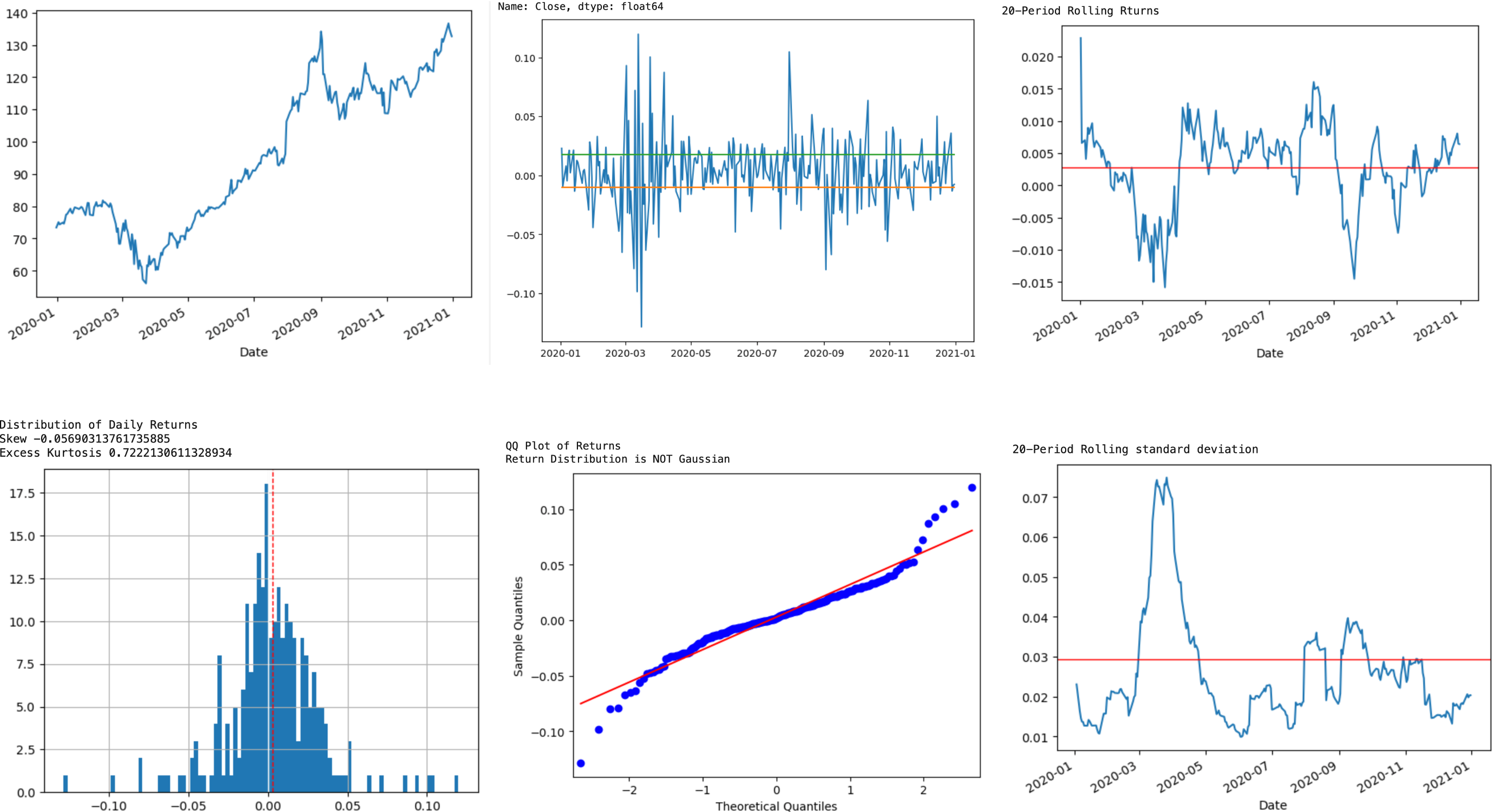
Stock traders know that returns are not normally distributed, as the charts below from an early analysis clearly demonstrate. Extreme outlier moves, whether driven by mass panic/greed or unexpected external events, occur far more often than statistical science says they should. Here I was studying one- and 20-period returns on a favorite stock; I forget which one. I noted that when the stock price is sharply changing direction (at what technical traders call a pivot point) the returns are at unusually high or low values. In statistical parlance, I noted that the major pivot points occur when the returns are in the tails of that non-normal distribution curve. Non-geeks would just say the stock seems to move sharply up or down when the periodic returns are unusually high or low.
It was no earth-shattering moment, but it got me wondering if this phenomenon could be engineered into good feature inputs to train a machine learning algorithm. Beyond simple correlation, I needed to devise features that would occur ahead of the price change, not as responses to it. In short, I needed to find causes, not effects.
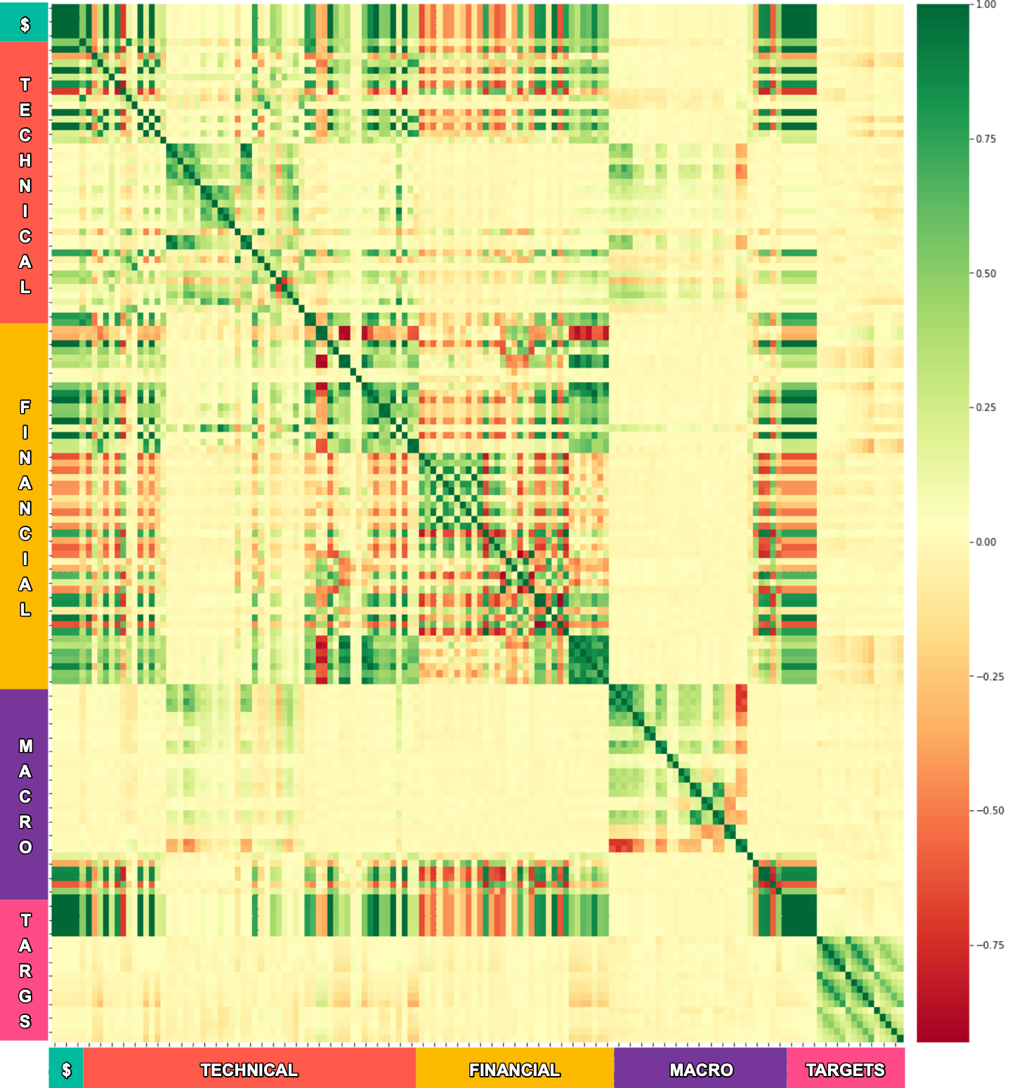
That challenge inspired me to engineer hundreds of potential features (no easy feat!) and do complex correlation studies on multiple stocks, with an example shown in the colorful graphic at the top of this article. Trust me, I find it as intimidating as you, but if you study it for a while, you can discover some useful things. The color in each cell represents the degree of correlation between the set of features down the left axis and the same set of features across the bottom axis. Correlation is a measure of how well the movement up or down in the value of the first feature matches the movement in the second.
Features are 100% correlated to themselves which accounts for the dark green diagonal line in the chart. Very high/low correlations imply that the first feature is essentially the same as the second, providing no new information. As an example for my technical analysis colleagues, using both an EMA-50 and an SMA-50 as inputs to a machine learning algorithm not only wastes processing time, but it can also worsen the predictive power of the algorithm by adding unnecessary complexity.
The features in the teal-colored section are the stock’s prices (open, high, low, close). I started this journey trying to forecast a future stock price, so these were my initial targets. Scanning along either axis within that teal sector, you can see a lot of deeply colored cells where the correlation is relatively high or low. A lot of things correlate with the stock price, notably anything that include price in its derivation. That only seem glaringly obvious in hindsight! Even more importantly, correlation does not necessarily imply causation – sounds like a line from some TV show about lawyers or detectives. Correlation is just a starting point for further analysis.
The red bars along the left & bottom axis are a sampling of the hundreds of technical analysis indicators I evaluated. Traditional technical analysis looks at the stock’s price and volume data, deriving various metrics like moving averages, or recognizable patterns like support and trend lines, or in the case of a relative strength indicator, compare one stock’s movement against a market benchmark. Although, they can be quite useful in timing the entry or exit of a trade, particularly in combination, the accuracy of any single indicator as a reliable predictor of future price movement is generally low. Witness the overall low correlations with price in this sector.
The orange sections are financial metrics for the stock, so-called stock fundamentals. My technical analysis colleagues often scoff at my interest in stock fundamentals. But, as you can see in the correlation study, there’s a lot of correlation between the fundamentals and the stock price! Going further, I dug into individual financial metrics, such as Gross Margin, as exampled in the graphs below.
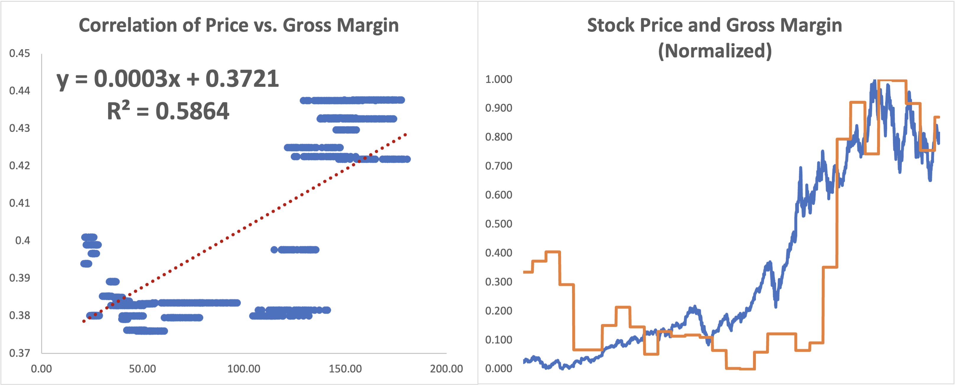
Fundamentals are reported quarterly, so comparing with end-of-day stock prices takes some data engineering. You can see that in the string of horizontal dots where only the price varied over the quarter. Amazingly, the best-fit regression line shows a strong correlation with the R-Squared suggesting that 58% of the change in price is attributable to the change in the gross margin, at least in this example. The time series graph, normalized to compare changes in price vs. gross margin, shows correlation as well, albeit the cause vs effect is more debatable. That’s one of the hard things about making a stock price prognosis – it’s anticipation of the future that often drives the price. Unfortunately I haven’t yet found a good multitudinous mind-reading feature!
The purple section, labeled Macro, looked at various macroeconomic and market-level factors. This early collection showed little correlation, but later I engineered several good macroeconomic features.
Finally, the dark-pink section was a set of new targets that I was exploring, including what would become the proprietary Q-Score. Although the correlations seem less than for the price targets, those weak correlations proved to be significantly better when they were used to prognosis a future Q-Score compared to a current stock price. I’ll keep that as a topic for an article on What Makes QScore Different?.